Feature: Task List
Project: Healthcare Temp Staffing Management System
Business Problem
Various features of the ShiftWise system consisted of configurable sets of activities, both manual and automated. When one activity is completed, it can initiate a subsequent activity, which may result in a task for a user.
For a customer managing large numbers of staff, the number of tasks generated by system activity can get out of hand. Email alerts for tasks, an available option, can be overwhelming.
Feature planned but not completed before the project was canceled.
Solution
Our solution was to list the tasks available to the user to complete, and to have that task list accessible from any page of the application.
Users still had the option of receiving email alerts for tasks and could choose whether and which emails to receive through managing their own settings.
My Role
Design the interface, test the designs with customers, interview customers, work with developers to implement changes in response to user feedback.
UX Artifacts
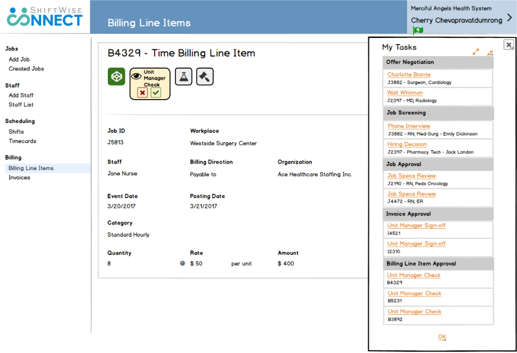
First iteration — wireframe for developers
Early stage user research, conducted remotely, combined usability testing and interviewing with customers. We learned that the optimal organization for tasks is by category, as well as the preferred order of categories.
The biggest takeaway from talking with users that they were looking for a “work queue” that would allow them to proceed from task to task within each category, without having to return to a list or look for the next item to work on. However, given that we were developing under the philosophy of Minimum Viable Product, our first iteration would be a basic task list.

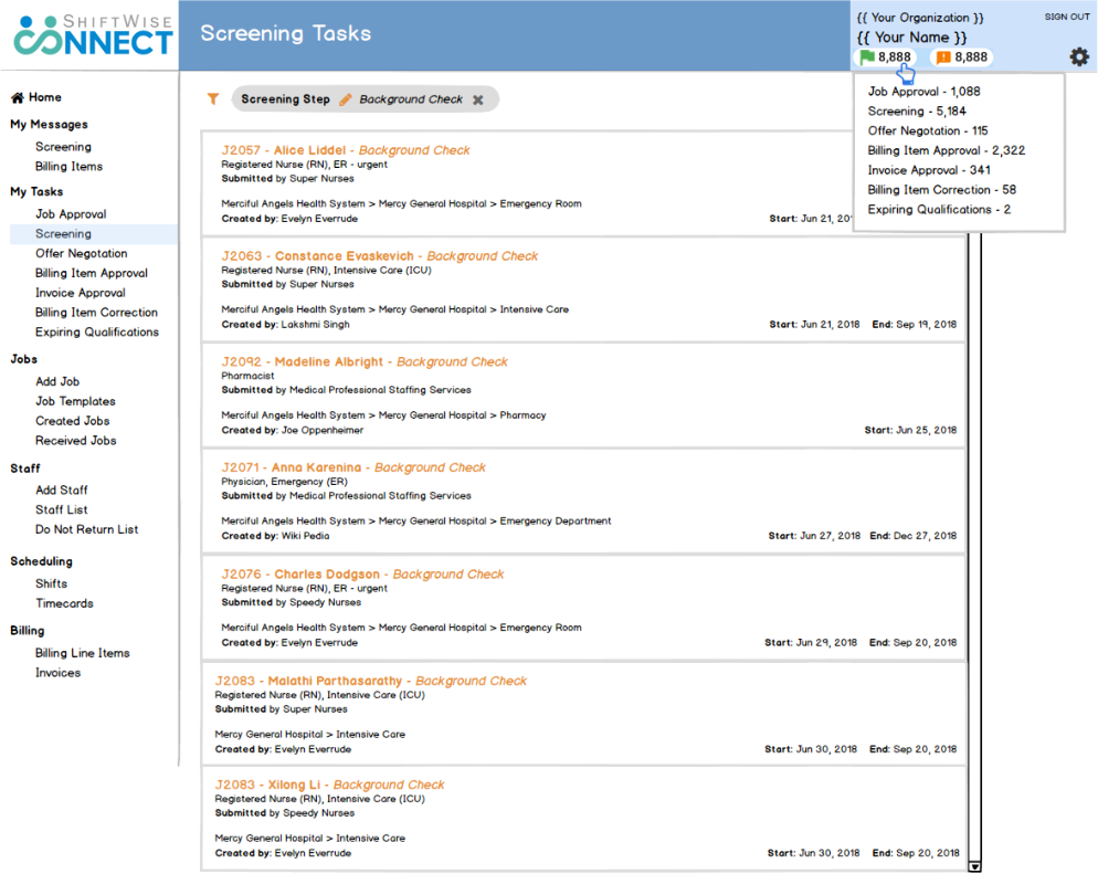
Second iteration — wireframe for developers
MVP Feedback: the simple dropdown list did not provide sufficient information.
Additional Design Consideration: green flag icon did not support the long numbers that were actually generated by task lists
Design Response:
- Redesigned task list as a dedicated page with critical information on cards
- Redesigned task count visual element as a white oval ‘tic tac’; we also needed to show quantity of unread messages, so a ‘tic tac’ worked for that purpose as well.
We considered the concept of listing the categories for tasks and messages in the navigation panel, but I had concerns that it would push other navigation elements too far down. Which categories would be displayed depends on the user’s level of permission; wireframe shows “worst case scenario.”

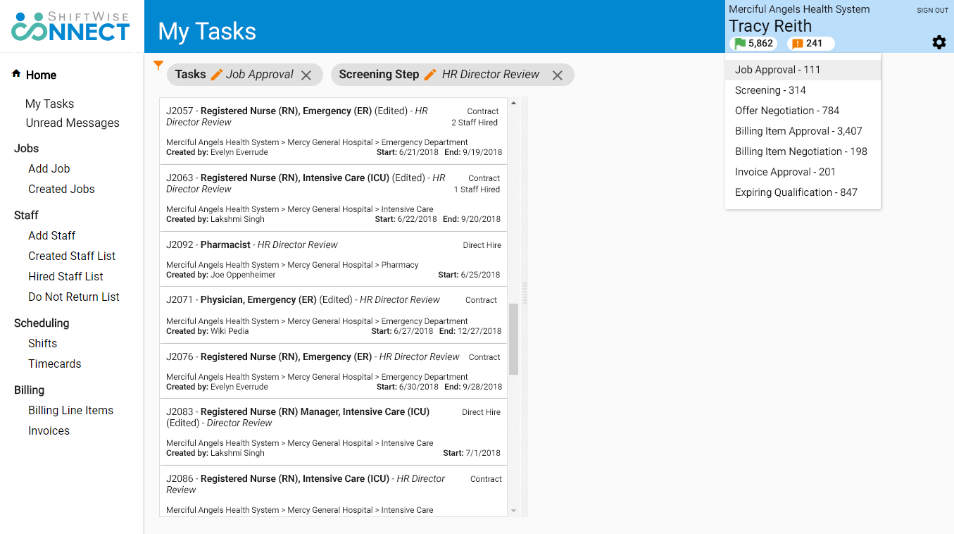
Second iteration — high fidelity mockup for developers
I deliberately left space to the right of the task list. My intent was to use this space to return the specific UI component for the task the user needs to complete. This would get closer to a work queue, allowing users to proceed from task to task, without leaving the page; displaying the actual task component was out of scope for this iteration.
