Feature: Job Templates

Project: Healthcare Temp Staffing Management System

Business Problem

Most jobs posted for healthcare staffing are repetitious; usually only the start date needs to change. Users shouldn’t be expected to fill out an entire form with the same information for each new posting.

Feature planned but not completed before the project was canceled.

Solution

Job templates allow customers to save and reuse job postings. Through roles, customers could control which users had permission to edit all details when creating jobs and which users had permission to view sensitive salary information.

My Role

Design screens for creating and managing job templates, and conduct usability testing and interview customers.

  • Create new job template
  • Create job template based on existing job
  • Edit job template
  • Activate/deactivate job template
  • Create job based on job template

UX Artifacts

Low fidelity prototype for usability testing

Low fidelity click-through prototype

Test plan and script

Note: In presentation mode, only one Balsamiq page is visible at a time, unlike this pdf, which one can scroll through.

Usability testing showed where users were likely to click, depending on whether they were creating a new job template, editing an existing job template, or creating a new job based on a template. Users preferred to make a copy of a job before saving it as a template, even when button labeled ‘Save as Template’ was available on the job form.

Interviewing revealed preferred terminology (e.g., copy versus clone), and what job template details should be made visible available to users with different levels of permission.
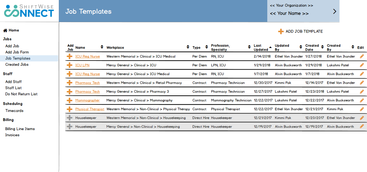
wireframe for user testing

Wireframes for developers

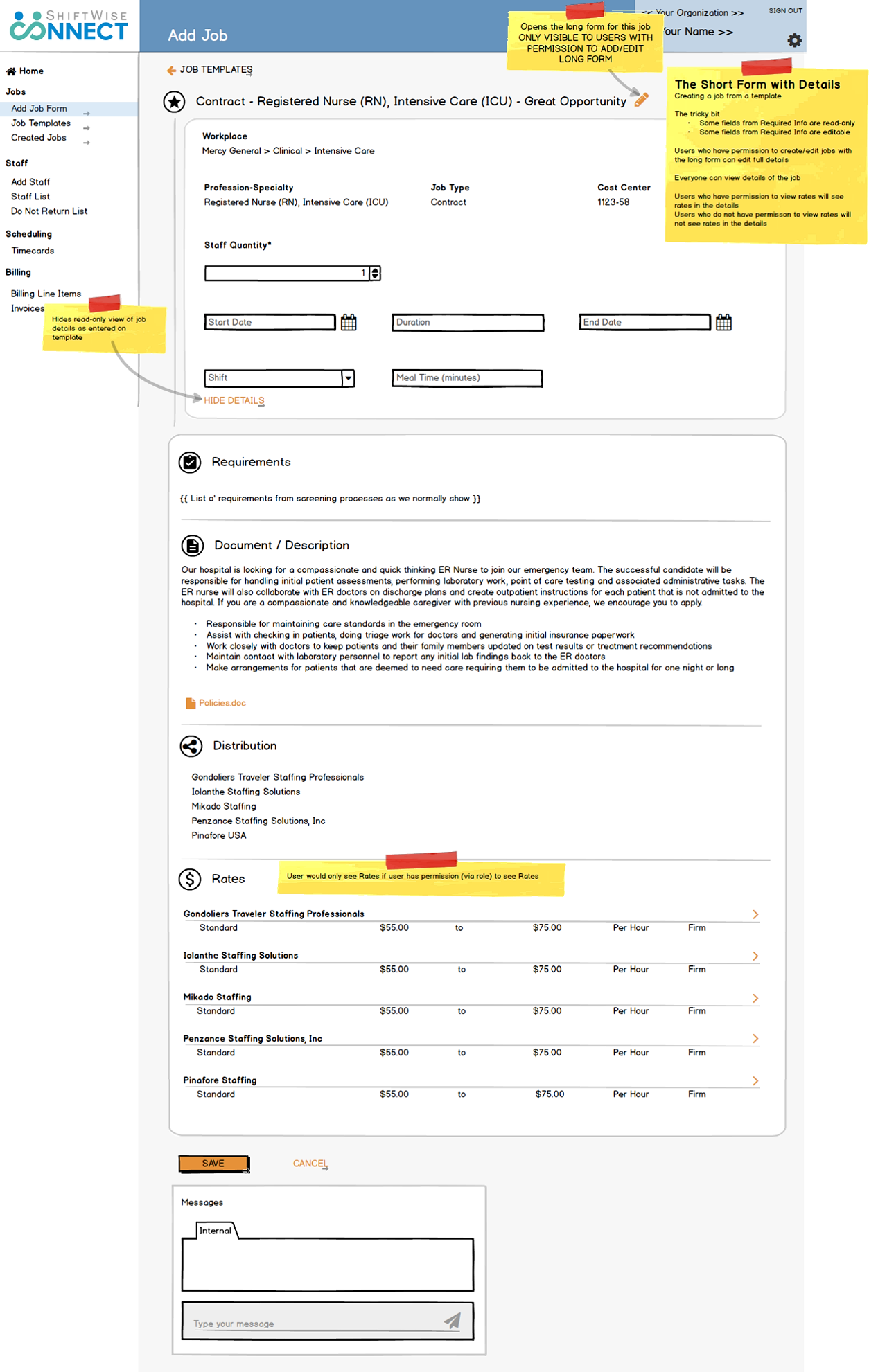
All users would see this view of a job created from a template.
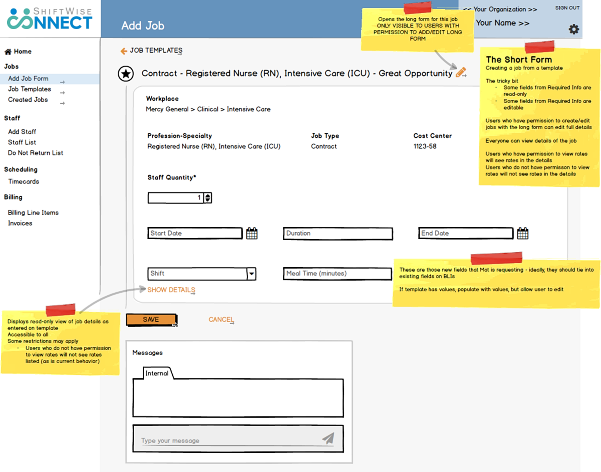
wireframe showing minimally editable form

Details are available if desired.

wireframe showing details

Only users with permission can edit the full details of a job posting.
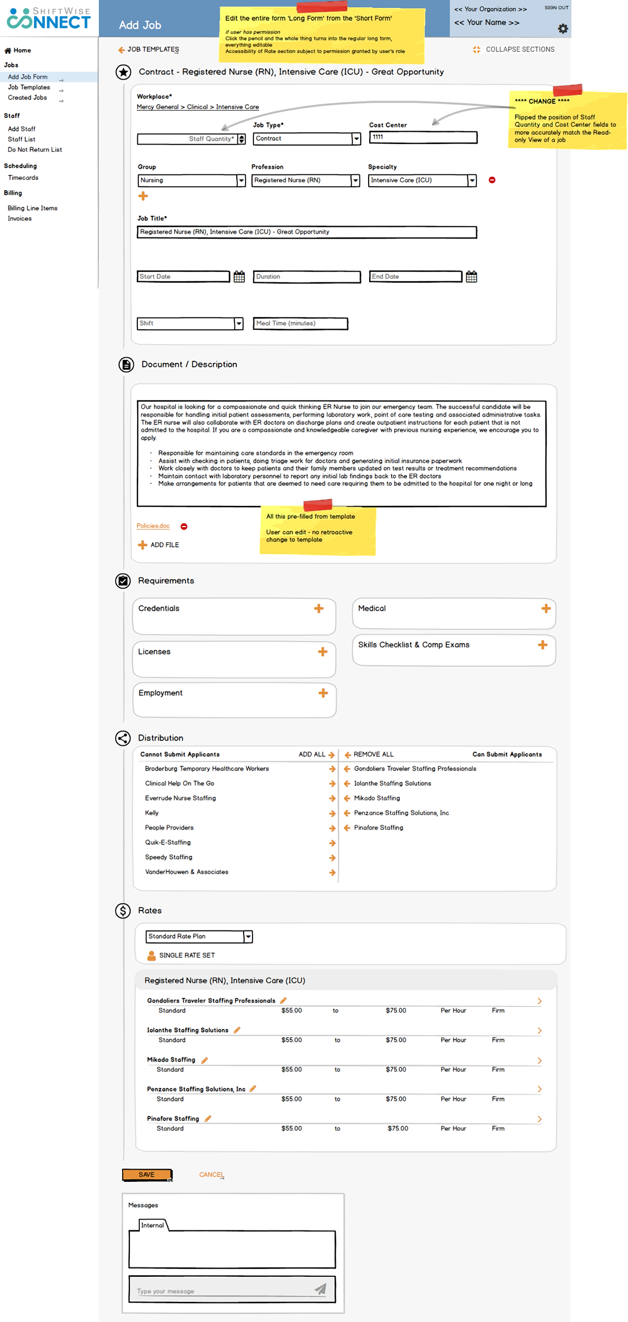
wireframe showing entire editable form

Feature: Task List

Project: Healthcare Temp Staffing Management System

Business Problem

Various features of the ShiftWise system consisted of configurable sets of activities, both manual and automated. When one activity is completed, it can initiate a subsequent activity, which may result in a task for a user.

For a customer managing large numbers of staff, the number of tasks generated by system activity can get out of hand. Email alerts for tasks, an available option, can be overwhelming.

Feature planned but not completed before the project was canceled.

Solution

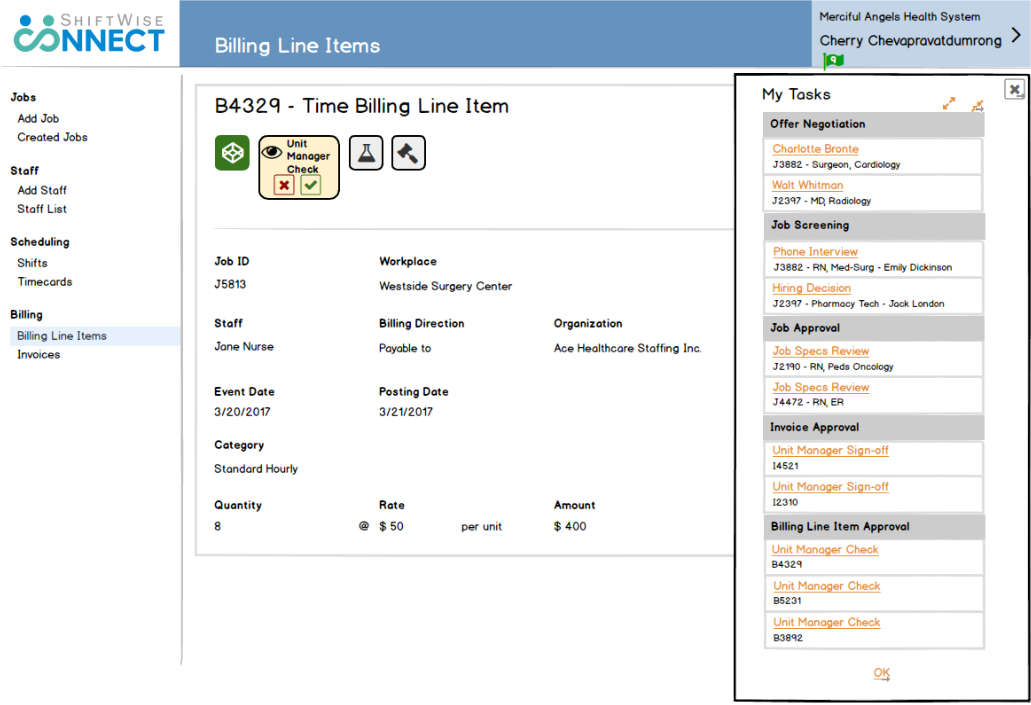
Our solution was to list the tasks available to the user to complete, and to have that task list accessible from any page of the application.

Users still had the option of receiving email alerts for tasks and could choose whether and which emails to receive through managing their own settings.

My Role

Design the interface, test the designs with customers, interview customers, work with developers to implement changes in response to user feedback.

UX Artifacts

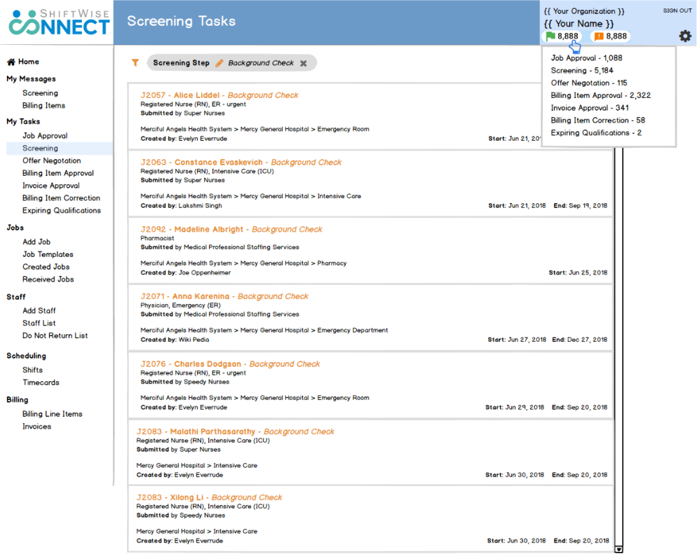
First iteration — wireframe for developers

Early stage user research, conducted remotely, combined usability testing and interviewing with customers. We learned that the optimal organization for tasks is by category, as well as the preferred order of categories.

The biggest takeaway from talking with users that they were looking for a “work queue” that would allow them to proceed from task to task within each category, without having to return to a list or look for the next item to work on. However, given that we were developing under the philosophy of Minimum Viable Product, our first iteration would be a basic task list.

first iteration wireframe of task list

Second iteration — wireframe for developers

MVP Feedback: the simple dropdown list did not provide sufficient information.

Additional Design Consideration: green flag icon did not support the long numbers that were actually generated by task lists

Design Response:

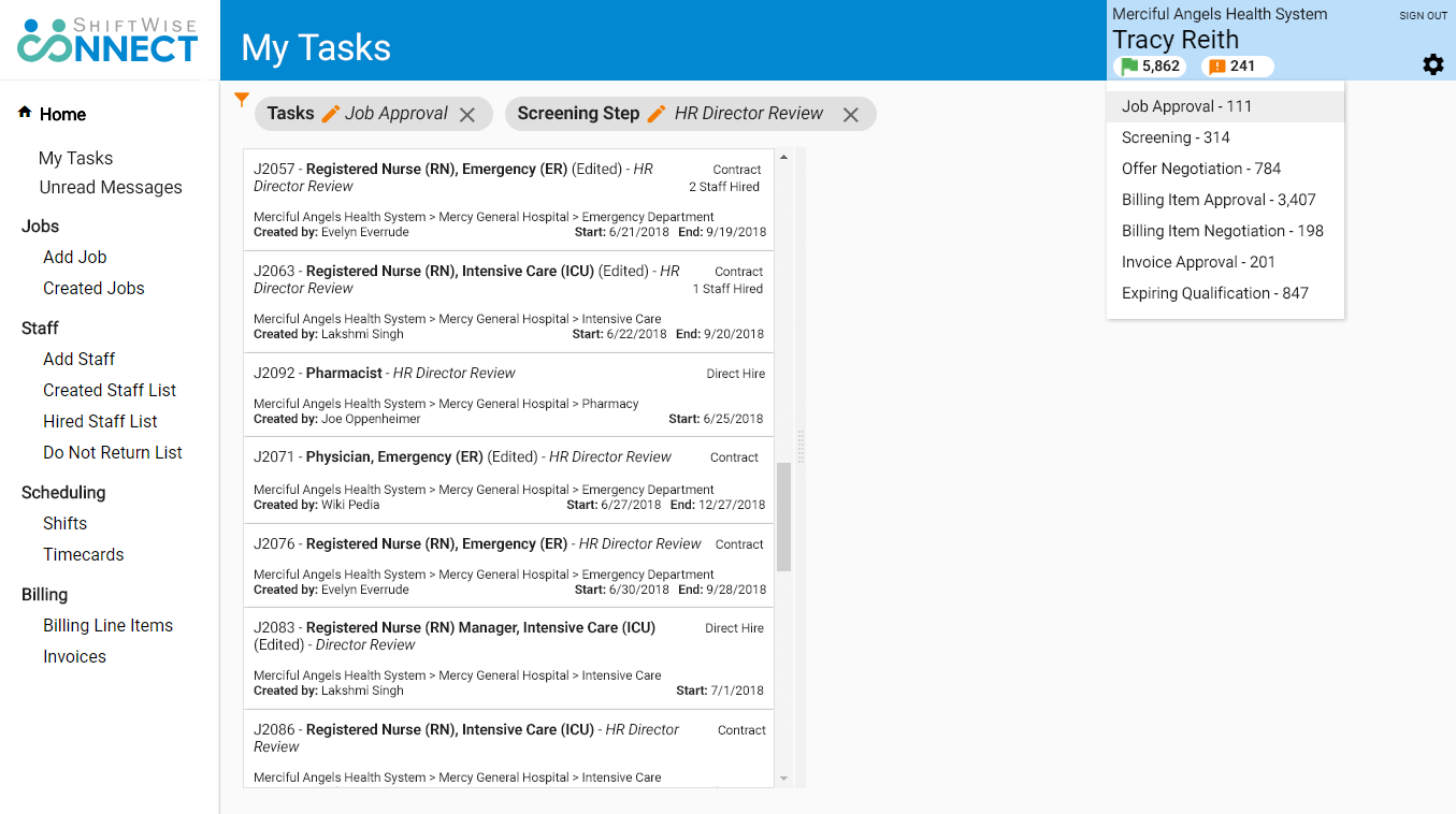
  • Redesigned task list as a dedicated page with critical information on cards
  • Redesigned task count visual element as a white oval ‘tic tac’; we also needed to show quantity of unread messages, so a ‘tic tac’ worked for that purpose as well.

We considered the concept of listing the categories for tasks and messages in the navigation panel, but I had concerns that it would push other navigation elements too far down. Which categories would be displayed depends on the user’s level of permission; wireframe shows “worst case scenario.”

second iteration wireframe of task list

Second iteration — high fidelity mockup for developers

I deliberately left space to the right of the task list. My intent was to use this space to return the specific UI component for the task the user needs to complete. This would get closer to a work queue, allowing users to proceed from task to task, without leaving the page; displaying the actual task component was out of scope for this iteration.

second iteration mockup of task list

Feature: Do Not Return List

Project: Healthcare Temp Staffing Management System

Business Problem

In the healthcare temporary, or contingency, staffing field, hiring the right staff can literally be a matter of life or death. Employers need to ensure that temporary staff that are not a good fit are not hired again.

The reasons for “Do Not Return” range from lacking appropriate training or certification to serious ethical, safety, or legal violations. Employers need flexibility when indicating that they do not want a specific individual to work at their facility or specific units, appropriate to the situation.

Solution

The solution would need to provide options for

  • Time limited ban v. permanent ban
  • Ban from an entire facility v. ban from selected units
  • Record reasons for blocking return

We also needed to ensure that when a person is banned from working at a given healthcare facility, that person is uniquely identified and not conflated with someone with an identical name.

ShiftWise favors providing information for users to make their own decisions, rather than blocking them from taking specific actions. Being listed as “Do Not Return” will not prevent a staff from being applied to a job, but it will alert the prospective employer.

Role

I designed the necessary screens and specified system behavior, and worked with developers as they implemented the feature.

Product management prioritization and adherence to the principle of MVP meant that some functionality, such as filtering, would be put off for a later iteration.

UX Artifacts

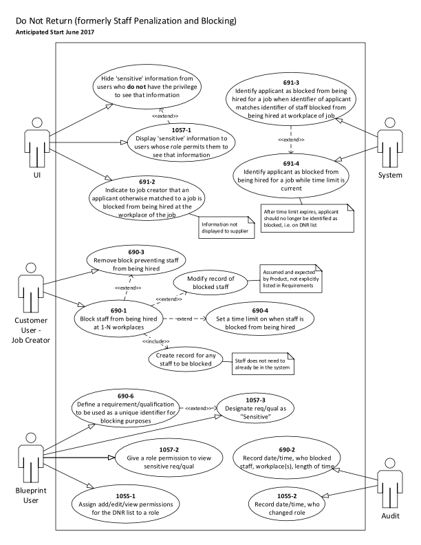
Use case diagram for developers

My developers told me they found use case diagrams useful. I find it a helpful activity to break down the functionality needed and assign each piece of functionality to the responsible party, including the system itself.
use case diagram for Do Not Return list functionality

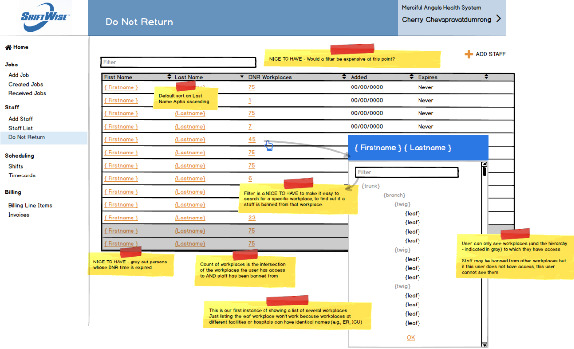
Do Not Return List

Wireframe for developers

wireframe of Do Not Return list

Final screen

screenshot of Do Not Return list

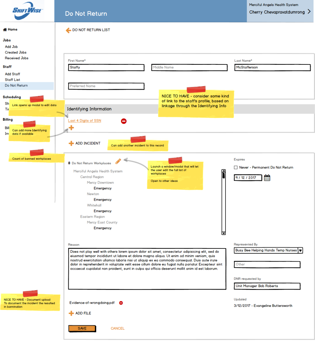
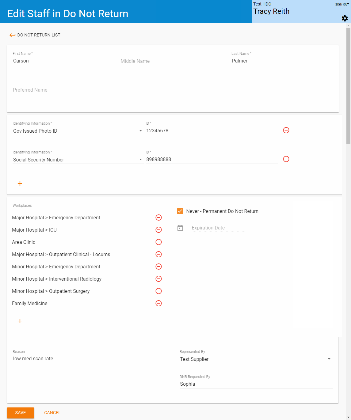
Do Not Return entry

The ability to see “sensitive identifying information” is controlled by a permission applied to roles. Clients can choose what identifying information, such as SSN or a different unique identifier, to identify each staff, through configuration. This is not hard-coded in the system. A unique identifier is necessary to prevent a ban on a given “John Smith” being applied to all persons named “John Smith.”

Wireframe for developers

wireframe of Do Not Return entry

Final screen

screenshot of Do Not Return entry

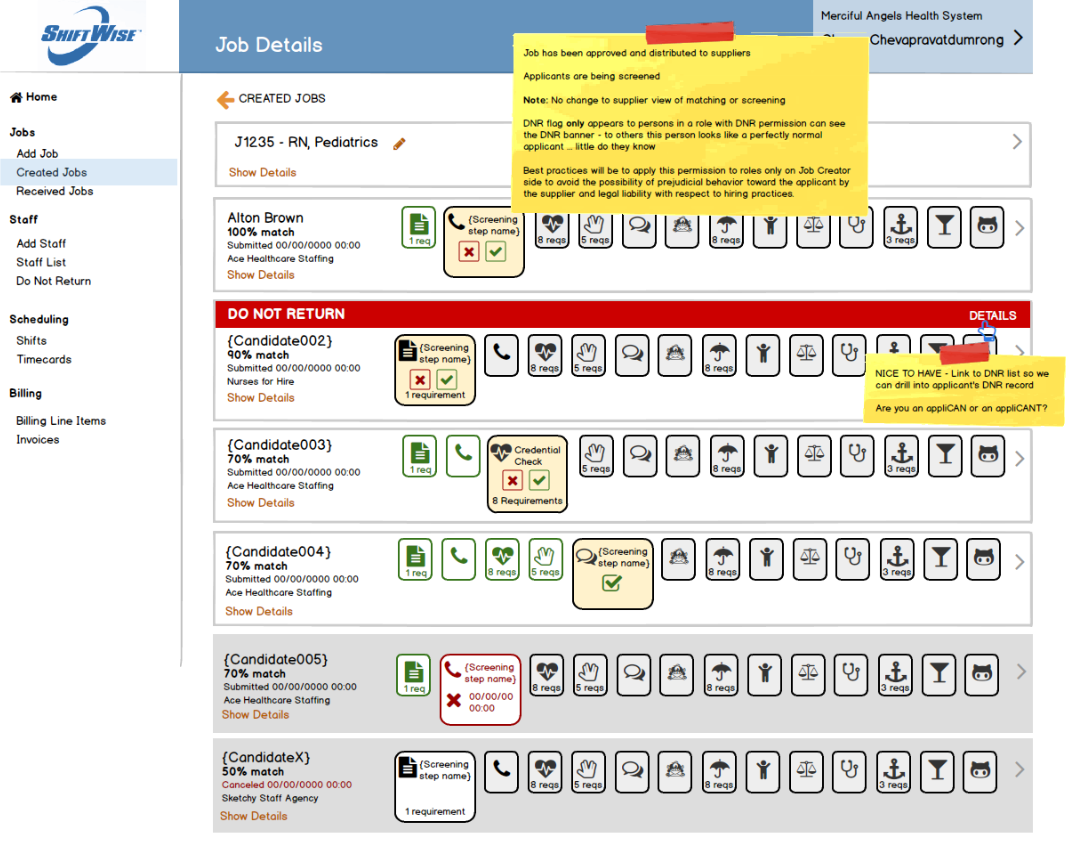
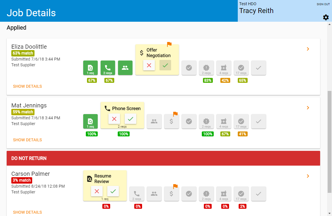
Do Not Return indicator on Job Applicants list

I made that indicator big and ugly and impossible to miss.

Indication that a staff is on the Do Not Return list is visible to a prospective employer, after the staff is applied to a job. Staffing agencies are not aware that one of their staff has been placed on a facility’s Do Not Return, unless the prospective employer specifically informs them. This was a deliberate decision to avoid possible bias and consequential legal liability in applying staff to jobs at other employers where the staff is not prohibited from working.

Wireframe for developers

wireframe of Do Not Return indicator

Final screen

screenshot of Do Not Return indicator

Project: Paperless Dock Contingency System

Business Problem

Through its Paperless Dock initiative, Con-way successfully reduced the amount of paperwork needed to accompany freight as it moved through its nationwide shipping network to nearly zero. Freight information was delivered over a computer network, accessed through its “Navigator” intranet application and through rugged, handheld devices used by drivers and dockworkers. But even if the company computer network goes down, freight must still move — critical freight documentation must be made accessible through alternate means.

Solution

Freight data was regularly “scraped” from the company system and copied to cloud-based storage. During a computer network outage, service center personnel would be able to pull data from a separate website, for freight at or expected to arrive at their service center. This documentation then accompanied the freight to subsequent destinations, ensuring seamless end delivery.

Role

As the User Experience Designer, my goal was to design an interface that 1) requires no training to use, 2) provides ready access to all necessary freight documentation, and 3) loads quickly.

I also created the templates for formatting raw data as it was extracted from cloud storage and formatted for output.

UX Artifacts

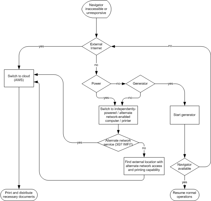
User activity flow

User activity flow diagram

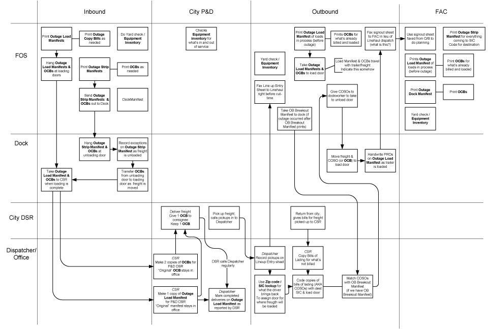
Swim lanes showing movement of documentation across network

Swim lane diagram showing movement of documentation across freight network

Low fidelity wireframe used for early user testing

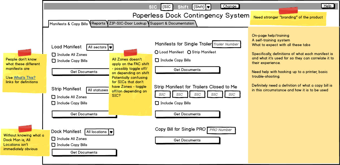
Each iteration of the design incorporated information learned from users, such as regional differences in terminology and differing levels of knowledge. The interface got progressively simpler as extraneous elements were stripped away.

Yellow “stickies” indicate results from testing that were incorporated into subsequent design iterations.
Low fidelity wireframe of user interface

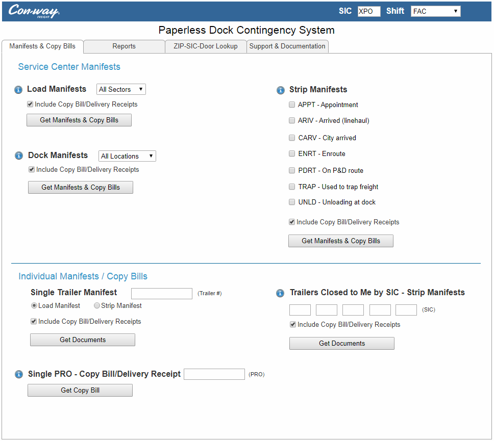
Final design — high-fidelity interactive prototype

This prototype, built with AxureRP, represents the final design, and includes sample documentation.
High-fidelity interactive prototype

Final decisions included replacing a help section with embedded help topics and selection of specific items by default.

High fidelity mockup of final design